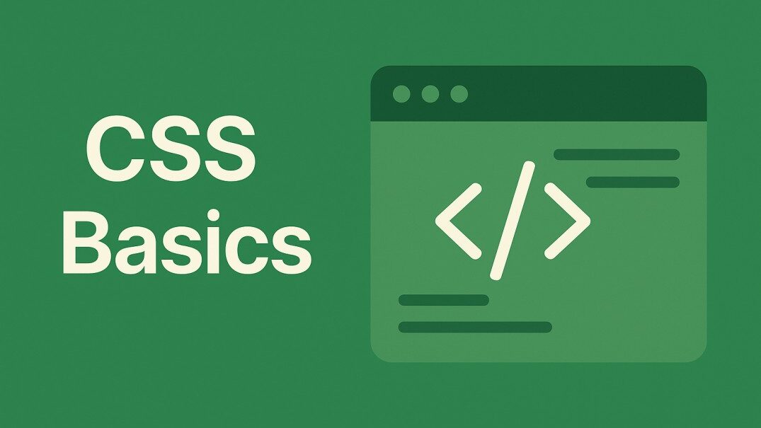
Mastering CSS Fundamentals: First Dive into Styling Webpages
Mastering CSS Fundamentals: Your First Dive into Styling Webpages
Welcome, aspiring web creators! Ever wondered how websites get their stunning looks, vibrant colors, and perfectly aligned text? The secret lies in CSS – Cascading Style Sheets. If you’re just starting your journey into web development, understanding CSS is absolutely crucial. It’s what transforms a plain HTML document into a beautiful and engaging user experience.
In this beginner-friendly guide, we’ll explore some of the most common and essential CSS properties you’ll encounter. Think of these as your basic toolkit for styling text, sprucing up backgrounds, adding neat borders, and controlling the size of your elements. Get ready to make your webpages pop!
Styling Your Text: Making Words Look Good
Text is everywhere on the web, and CSS gives you incredible power to style it. Let’s look at the foundational properties for text styling:
color: This is exactly what it sounds like – it sets the color of your text. Want your heading to be a vibrant blue? Just usecolor: blue;. Easy peasy!font-family: Ever noticed how different websites use different fonts? That’s thanks tofont-family. You can specify fonts like Arial, Helvetica, or custom web fonts to give your content a unique feel. This is key for typography and readability.font-size: Control the size of your text. Whether you want large, eye-catching headlines or small, subtle captions,font-sizelets you dictate how big or small your words appear.font-weight: Want to make text bold or extra-bold for emphasis?font-weightis your friend. It controls the boldness of your font.text-align: Position your text with precision. You cantext-align: center;to center text,text-align: left;for left alignment, ortext-align: right;for right alignment. Perfect for page layout and visual hierarchy.line-height: This property adjusts the spacing between lines of text. Proper line height significantly improves text readability, making your content easier on the eyes.
Beautiful Backgrounds: Setting the Scene
Beyond just text, CSS allows you to create captivating backgrounds for your sections or entire web pages. These background properties are essential for design:
background-color: The simplest way to add a splash of color! This sets the solid color of an element’s background.background-image: Why settle for a plain color when you can have an image? Usebackground-imageto set a picture as your background.background-repeat: What happens if your background image is small? By default, it repeats. Usebackground-repeat: no-repeat;to show it only once, orrepeat-xandrepeat-yto repeat it horizontally or vertically.background-position: Control where your background image sits within its element. You can place itcenter,top left, or even use precise pixel values. This is vital for image placement.background-size: This is super important for responsive design! Usebackground-size: cover;to make your image cover the entire area without distortion, orcontainto ensure the entire image is visible.background(Shorthand): For the pros! This is a shorthand property that lets you combinebackground-color,background-image,background-repeat, andbackground-positioninto one concise line of code. It’s a great way to write efficient CSS.
Adding Borders: Defining Your Boxes
Borders are fantastic for visually separating content, creating distinct sections, or just adding a decorative touch. Here are the core border properties:
border-width: How thick do you want your border to be? This property defines the thickness of the border around an element.border-style: This determines the appearance of the border. Common values includesolid(a continuous line),dotted,dashed,double, and more.border-color: Just like text, you can set the color of your border. Make it match your design or stand out!border(Shorthand): Similar to backgrounds,borderis a shorthand property that lets you set theborder-width,border-style, andborder-colorall in one go. It’s incredibly convenient for quick styling.
Dimensions: Controlling Size and Space
Controlling the size and dimensions of your web elements is fundamental to layout design and responsive web development.
width: Sets the width of an element. You can specify it in pixels, percentages, or other units.height: Sets the height of an element. Just likewidth, you can use various units.max-width: This is a powerful property! It sets the maximum width an element can be. This is crucial for responsive design, ensuring your content doesn’t stretch too wide on large screens.min-width: Similarly,min-widthsets the minimum width an element can be. This prevents content from becoming too narrow and unreadable on smaller screens.max-height: Sets the maximum height an element can be. Useful for preventing elements from becoming excessively tall.min-height: Sets the minimum height an element can be. Ensures an element always has a certain height, even if its content is minimal.
Your CSS Journey Begins Now!
This exploration of common CSS properties is just the beginning of your exciting journey into web design and front-end development. By understanding and practicing with color, font-family, background-color, border, width, and height, you’re building a solid foundation.
These fundamental properties are the building blocks for creating visually appealing and well-structured web pages. Keep experimenting, keep coding, and watch your design skills grow!